How to make your beautiful Shopify store actually visible to customers
The Designer's Dilemma: When Beautiful Doesn't Equal Profitable
.jpg)
So why does this invisible store syndrome happen? The answer lies in how designers have been trained to think about great design. We obsess over the perfect colour palette, spend hours tweaking typography hierarchy, and meticulously craft user experiences that feel effortless and intuitive. But somewhere in design school or through years of aesthetic-focused training, we developed a blind spot that's costing us thousands of potential customers every month.
Here's the uncomfortable truth: The same perfectionist attention to detail that makes your store visually stunning is often working against your discoverability. We're making choices that feel right from a design perspective but are completely invisible to the search engines that could be sending us qualified customers every single day.
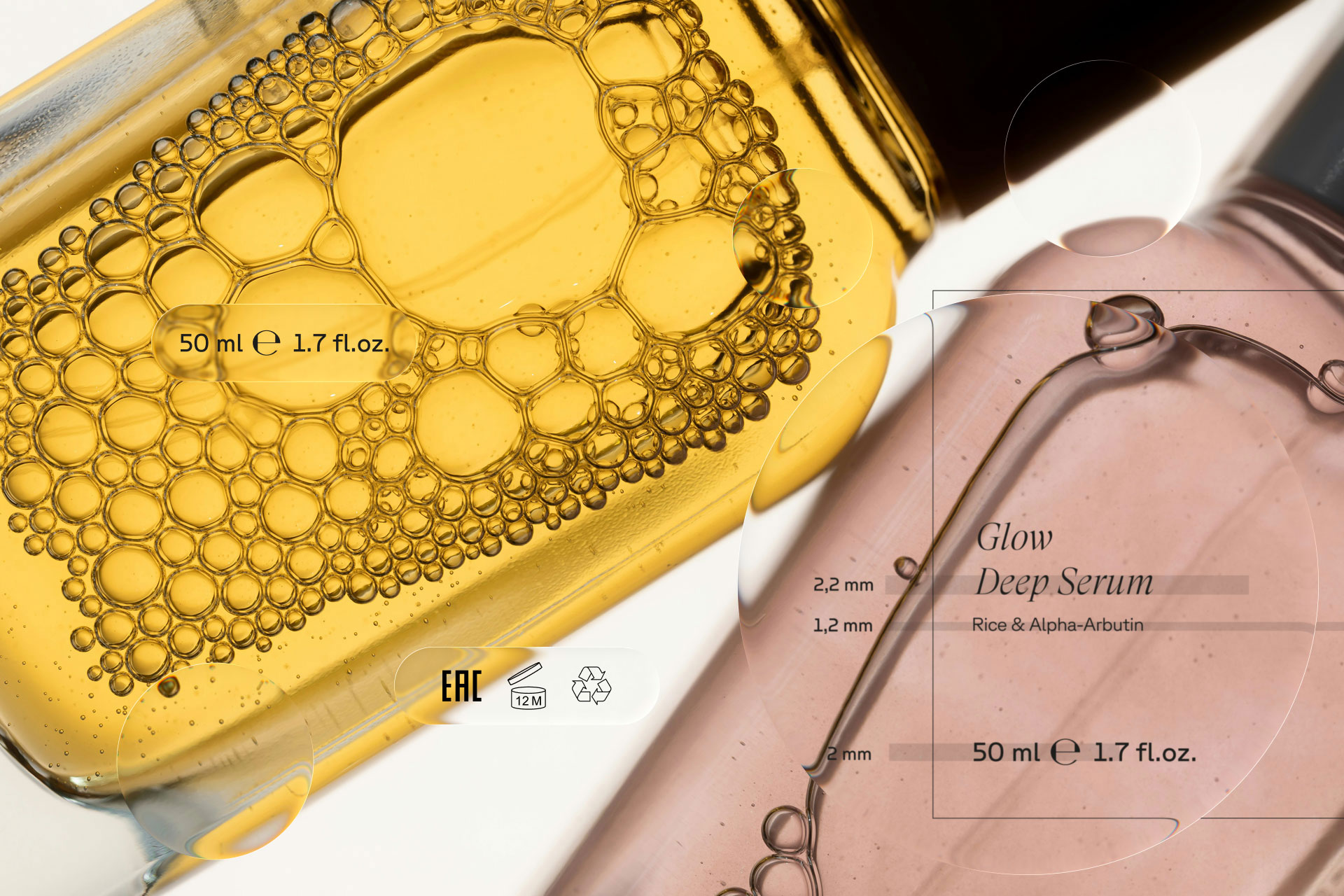
Picture this embarrassingly familiar scenario: You spend three hours perfecting the lighting in a product photo, another two hours fine-tuning the color balance until it's absolutely perfect, compress it just enough to maintain that crisp quality you're known for, and then... upload it as "IMG_2847.jpg." Meanwhile, you're wondering why your gorgeous jewelry isn't showing up when people search for "handcrafted silver necklaces" – completely oblivious to the fact that Google has no idea what that beautiful image actually contains.
It's like creating the most stunning storefront display in the world and then forgetting to put up a sign that tells people what you're selling. Technically flawless execution, strategically invisible impact.
The plot twist that changes everything: When you rename that same file to "handcrafted-silver-necklace-minimalist-design.jpg" and add alt text that actually describes what customers will love about it, you've just transformed a pretty picture into a customer-attracting magnet. Same gorgeous image, exponentially more discoverable. This is the kind of simple change that makes you wonder why no one taught you this stuff alongside color theory.
The URL situation gets even more entertaining – and by entertaining, I mean potentially revenue-crushing. We've all been there, choosing "yourstore.com/collections/item-001" because it looks clean and minimalist in our site architecture. It feels so organized, so aesthetically pleasing when we're building our navigation. Meanwhile, our competitor down the street is using "yourstore.com/silver-jewelry/minimalist-necklace" and wondering why they're dominating search results for terms we should own.
Here's where it gets really interesting – the great speed versus beauty showdown that's happening in every designer's mind. We convince ourselves that search-friendly images must look like pixelated disasters from the early internet days, so we choose slower-loading high-resolution images because we'd rather have a beautiful ghost store than a fast ugly one. But here's the secret sauce that changes everything: with the right compression techniques, you can have images that load lightning-fast AND look absolutely stunning. It's not choosing between beauty and performance – it's discovering that they can enhance each other.
The product title comedy hour deserves special attention because this is where designer minimalism meets customer search reality, and the results are often hilariously counterproductive. Picture a customer searching for "handcrafted silver necklace for women everyday wear minimalist design" and finding your product titled simply "Silver Necklace." It's like going to a restaurant and asking for "the pasta with wild mushrooms, truffle oil, fresh herbs, and aged parmesan" and the waiter responding, "Oh, you mean pasta." Technically correct, completely unhelpful, and guaranteed to send customers running to competitors who actually speak their language.
The invisible magic happening behind your beautiful design is where things get genuinely exciting – and where most designers discover they've been missing the biggest opportunity of all. Schema markup and structured data sound terrifyingly technical, but they're actually like having a personal translator who explains your products to Google in exactly the language search engines understand best. Think of it as the difference between mumbling directions to a lost tourist versus giving them a detailed map with clear landmarks, photos, and step-by-step instructions.
This is where most designers have their lightbulb moment: SEO isn't the enemy of good design – it's actually customer research disguised as technical optimization. When you discover that your ideal customers search for "minimalist silver jewelry everyday wear" instead of just "silver necklace," you're not just optimizing for algorithms. You're learning how your customers actually think about your products, what benefits matter most to them, and what language resonates with their purchasing mindset.
Suddenly, everything shifts. Writing better product descriptions becomes less about keyword stuffing and more about speaking your customer's authentic language. Creating internal links becomes less about gaming some mysterious system and more about helping people discover products they'll genuinely love. Optimizing images becomes less about meeting technical requirements and more about making your beautiful work discoverable by the people who are actively searching for exactly what you've created.
The real game-changer happens when you realize that your design decisions need to work in contexts you probably never considered during your creative process. Your carefully chosen brand colors need to look amazing not just in your controlled product photography, but in Google search result previews, social media thumbnails, and mobile device displays at 6 AM when someone's scrolling through Instagram over their morning coffee. Your typography needs to remain readable and impactful whether someone encounters it on a 27-inch monitor or a smartphone screen while walking down the street.
This isn't about compromising your creative vision – it's about ensuring that vision actually reaches the humans who will appreciate, share, and purchase it. The most successful designers treat search optimization like learning a new design software: initially intimidating, ultimately empowering, and absolutely essential for creating work that performs as beautifully as it looks.
Want to know the secret that separates design practices that struggle to find clients from those that have customers knocking down their doors? The thriving ones stopped treating SEO as an expensive afterthought and started understanding it as an integral part of creating effective design. Their clients don't see search optimization as an additional cost – they see it as the strategy that ensures their beautiful investment actually generates measurable results.
The transformation is honestly spectacular to witness. Projects become more successful because gorgeous design work actually reaches its intended audience. Clients feel more confident in their investment because they can track real performance improvements. Designers feel more strategic and valuable because their creative decisions are informed by actual customer behavior rather than just aesthetic preference.
Here's your wake-up call: Your stunning Shopify store is like a masterpiece hanging in a gallery with no signage, no lighting, and no map to help art lovers find it. All that talent, creativity, and attention to detail deserves better than digital obscurity.
The path from beautiful-but-invisible to genuinely irresistible doesn't require choosing between aesthetic excellence and strategic performance. It requires understanding that these two priorities can work together in perfect harmony, creating designs that don't just win design awards – they win customers, generate revenue, and build sustainable businesses.
Ready to transform your invisible masterpiece into a customer magnet? The journey starts with understanding exactly which visibility gaps are keeping your beautiful work hidden from the people who are actively searching for it.
Your Free Shopify SEO Visibility Detective Kit
Before you can fix what's broken, you need to know what's actually happening behind the scenes of your beautiful store. This isn't another generic SEO checklist that leaves you more confused than when you started – it's a strategic audit designed specifically for designers who want to maintain their aesthetic standards while dramatically improving their discoverability.
What's hiding inside your free detective kit:
The Google Visibility Reality Check that shows you exactly how search engines see your store (spoiler alert: it's probably nothing like what you think). The Speed vs. Beauty Analysis that reveals whether your image choices are accidentally sabotaging your rankings. The Customer Language Decoder that uncovers the exact words your ideal customers use when they're ready to buy – not just browse. Plus, the Strategic Optimization Roadmap that prioritizes which fixes will deliver the biggest impact fastest, so you're not overwhelmed by a massive to-do list.
Download your free Shopify SEO Visibility Audit and discover exactly what's keeping your beautiful store invisible to the customers who are actively searching for what you're selling.